CSS Grid Blog

Copied to Clipboard
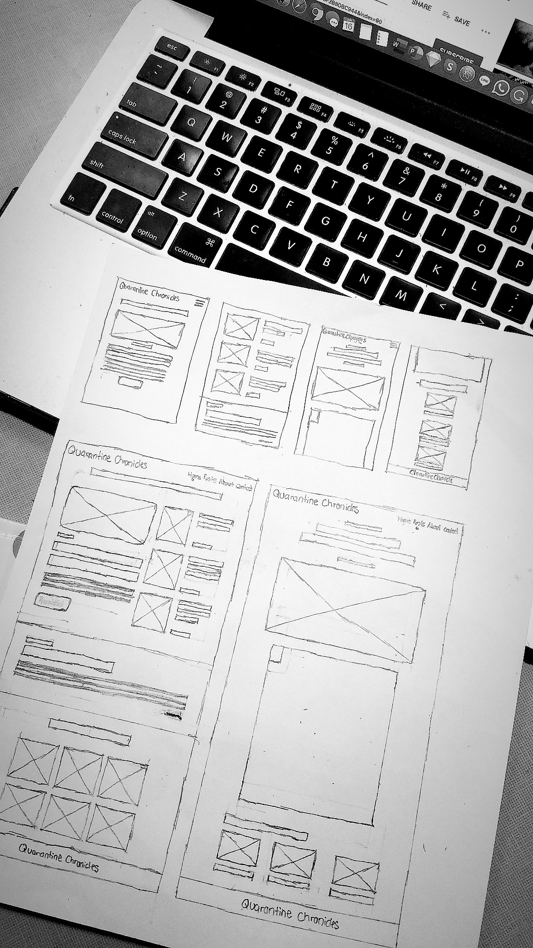
Wireframe of a blog site design. The design is placed on top of a Macbook Pro's keyboard. With an additional dark and black tone filter effect. By: Katherine Delorme
Wireframe Credit: Katherine Delorme

CSS has seen a lot of evolving with CSS3, SASS/SCSS, Flexbox, and now CSS Grid. I was slow to jump on the grid bandwagon, mostly because Flexbox was meeting my needs. After finally learning CSS Grid, I built this template for a blog with CSS Grid and a bit of Flexbox. This project allowed me to execute what I learned about CSS Grid.

The idea behind the blog was imagining someone blogging during quarantine due to the COVID-19 (Coronavirus) epidemic.

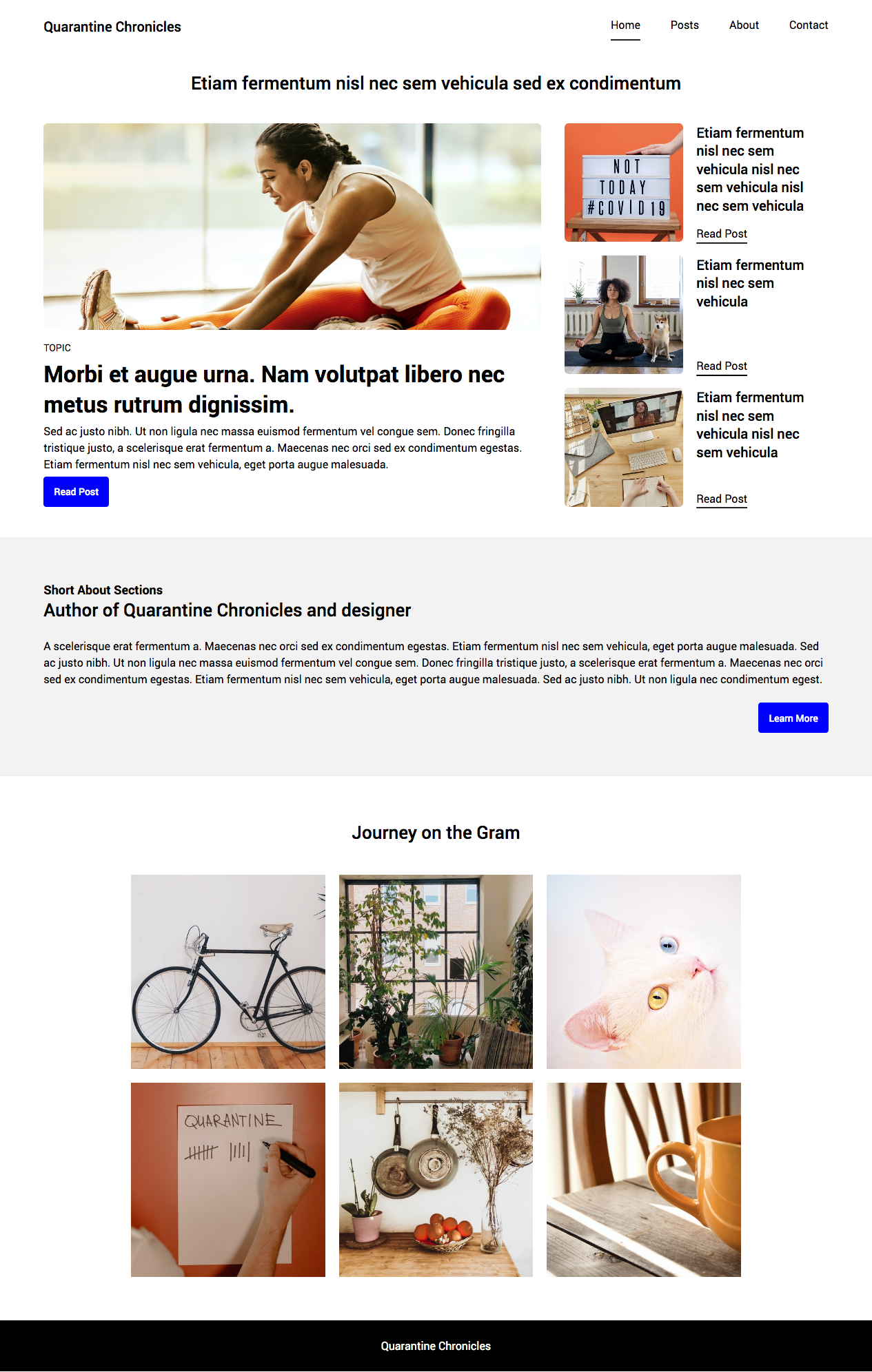
On the home page, I added a featured post with a brief description and a call to action button to read the post. Instead of having the featured post take the entire screen width, I included popular posts on a sidebar to the right. Below this section is a brief summary box for the author's bio or welcome message. Followed by an Instagram grid for images populated.

The structure of the website used semantic HTML and was styled with CSS and responsive layouts. The main sections used CSS Grid and individual areas Flexbox, and the layout was structured using grid columns and rows. The site is responsive on desktop, tablet, and mobile. All of which were outlined in a wireframe on paper before styling.
View the GitHub repo

Quarantine Chronicles a blog site design. image of the home page. By: Katherine Delorme
Home Page Credit: Katherine Delorme
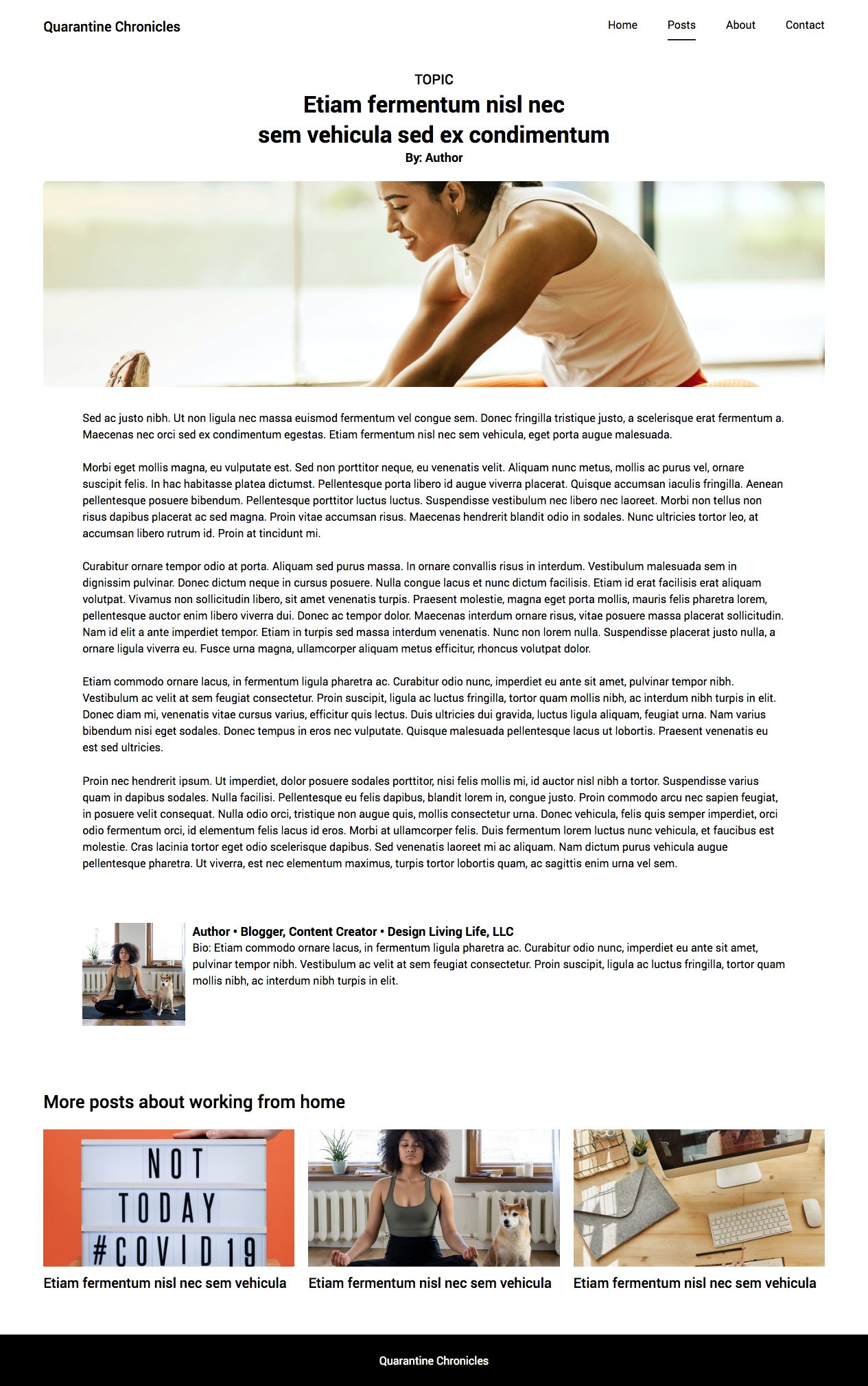
Quarantine Chronicles a blog site design. image of the blog post page. By: Katherine Delorme
Blog Post Credit: Katherine Delorme
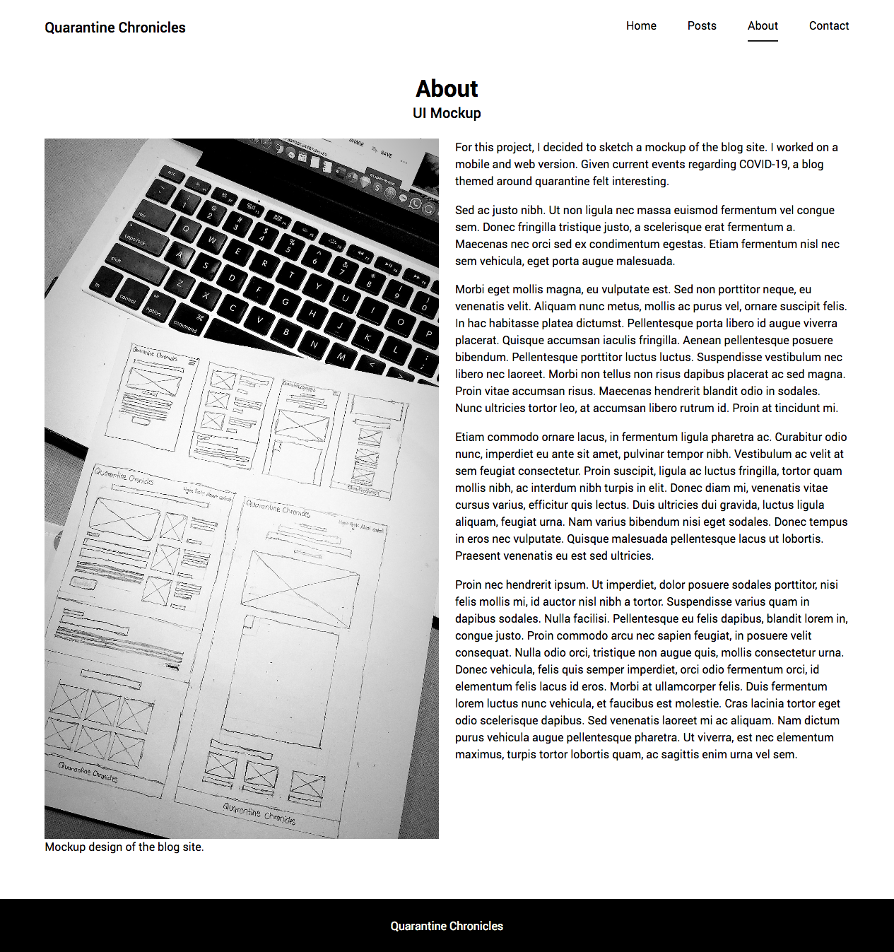
Quarantine Chronicles a blog site design. image of the about page.
About Page Credit: Katherine Delorme

Not only has CSS Grid reshaped the way we think and build layouts for the web, but it has also contributed to writing more resilient code. -CSS Tricks.


*Since this is my word vomit dumping ground you can find my more refined written words on Medium. I love using this space to explore my journey as a designer and developer while not getting pressed to write in the most splendid manner. Proofreading, revising and consistently editing take up so much time personally. In the past, this has caused me to write less often something I to avoid. My aim is consistency.
profile picture of Katherine Delorme

Katherine Delorme is UI/UX Designer with Frontend Development background. She loves creating designs that focus on solving problems more than following trends. Along with exploring how culture can impact design. She's most excited about inclusive design, and exploring how western and international design and usability contrast.

Her hobbies include learning the Japanese language, reading manga, watching anime and western cartoons, volunteering to teach the next generation of girls to code, hosting meetups, designing, and coding.

Share this post
Leave a comment
" data-num-posts="4" data-width="706">

subscribe via RSS | add to Feedly | follow on Instagram

Grab a Copy

Let's Talk Design

Join