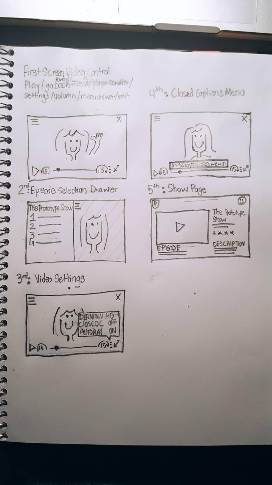
Today I decided to try out an Udemy course for prototyping. I wanted to do something in user interface (UI) design. I was also looking for something that would make use of SketchApp. I found Mobile App Design: From Sketches to Interactive Prototypes by Pablo Stanley. The course first started with sketching out prototype designs by hand on paper. Once we completed the sketches, we used Marvel App to simulate going through each page.


In the second section, Pablo Stanley discussed the reasons for creating prototypes. I suggest watching the course to hear all the reasons, but I did write down a few of them.
Why Prototyping?
- It elicits better feedback. When compared to telling about a screen or showing it.
- Able to quickly iterate on ideas, usability testing, validate (or not) assumptions before building something.
- It saves money, time, and helps bring clarity.
- Used for storytelling.
Afterward, he went over useful prototyping apps that fell into two categories static/simple and animated/granular. These apps were Invision, Marvel App, Flinto, Pixate, Framer, Keynote, and Principle App. He listed the benefits of each and how they differ.
From there, we began mockup a mobile prototype. It was of a quick sign up flow with some illustrations. It needed to have a friendly and inviting copy. I followed along using Sketch App. I did not have the illustrations, plus I'm not am illustrator, so I improvised. A visual designer can help with making the illustrations, or you can use a program like Illustrator or Photoshop to design your own.
I have four screens done, but it's getting late. I'll wrap this course up tomorrow.
